


If Lewis Carroll’s opening lines to Alice Through The Looking Glass are not enough to get me wanting to see the upcoming movie (or the mesmerising Disney trailers I’ve been watching online for that matter), then Urban Decay’s new limited-edition collection created in its honour certainly will.
The Alice Palette is one those eagerly-awaited launches that only come around once in a while. The collection is a follow-up to UD’s 2010 Disney collaboration, the Alice in Wonderland Book of Shadows, which sold-out within hours on the brand’s website.
I had one of those jaw-dropping moments the first time I set eyes upon it online – story here. I have now got my hands on the complete collection and it is every bit as wondrous and trippy as I had expected.

But enough of the pre-amble. What of the collection itself?

Completing the collection are five limited edition lipsticks, from an understated sheer nude to an edgy gunmetal navy with silver shimmer.
The Palette - Packaging


At the centrepiece is the pièce de résistance: a pop-up butterfly that springs to life as you open the panels (I will be posting a video demo on my Instagram shortly here).
Swatches
OK. There’s a lot to get through. I’ve swatched by character/column.
Alice (from right to left):
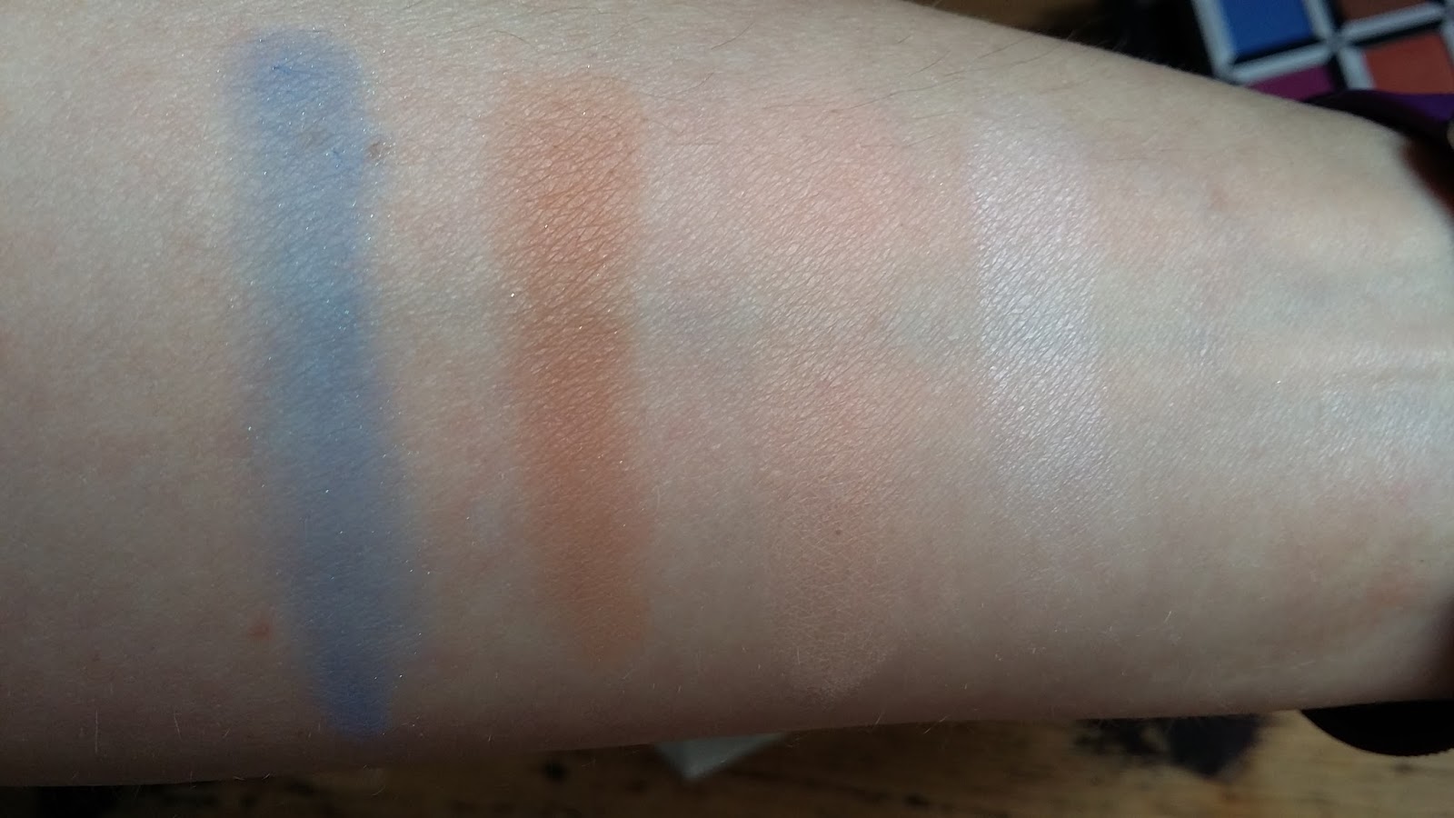
Reflection - soft peach matte
Dormouse – warm brown matte with floating gold micro-sparkle
Metamorphosis – vibrant periwinkle blue with micro-sparkle
Personal highlight – Metamorphosis. There isn’t a big colour pay-off here which may not be to everyone’s taste. It’s much less pigmented on the lid, a cool blue with a semi-opaque finish, but it really works for me.
Mad Hatter (from right to left)

Gone Mad – aubergine with pink iridescent pearl
Paradox – vibrant orange with gold pearl
Cake – saturated blue-pink with silver micro-shimmer
Personal highlight – Paradox. Super colour pay-off and it really catches the light. Love the warm, golden undertones.
Mirana (from right to left)

Duchess – peach with pink shift and micro-sparkle
Kingdom – copper-bronze pearl
Chessboard – medium brown matte
Personal highlight – Kingdom. Superb colour pay-off. It has warm, rosy-gold undertones, a soft texture and blends easily. It’s very buildable too.
Iracebeth (from right to left)

Bandersnatch – deep teal matte
Salazen Grum – metallic crimson
Royal Flush – pale beige shimmer
Personal highlight – Salazen Grum. A shimmery, deep coppery red. One of the more pigmented shades. It’s very creamy, glides on the lid and blends evenly and smoothly. I simply adore this– dress it up for evening or tone it down for day-time.
Time (from right to left)

Dream On – metallic purple-silver
Chronosphere – metallic deep bronze
Mirror – grey-taupe satin
Personal highlight – this is my favourite column (taken as a whole) with strong tones, good colour pay-offs and wearability. Though it also contains the most problematic shade, Dream On, which I had trouble picking-up. I’d suggest using a damp brush to get some intensity to the colour.
The Lipsticks – Packaging


Swatches (from right to left):

Mad Hatter – bright purple shimmer
Mirana – matte berry with tonal shimmer
Iracebeth – bright red matte
Time – gunmetal-navy with silver shimmer
My Look


I haven’t worn red lipstick as bright as this since I was in my 20s but I think it looks stunning. The formula feels super creamy, it goes on evenly and stays put. The colour pay-out is also tops. On the eyes I used Heads Will Roll all over the lids, Bandersnatch in the crease, Salazen Grum blended between the crease and brow, and Royal Flush to highlight both the brow and inner corner of the eyes.
Final thoughts
This is one highly desirable celluloid-inspired make-up collection. It’s every bit as trippy, madcap, whacky, nutty and chaotic (in a good way) as the film is sure to be. With its range of shades, textures and finishes there’s plenty of scope here to have a good play around, whether you’re looking to recreate looks from the film, come up with your own interpretations, or simply to conjure up something that’s daytime wearable - with perhaps a hint of daring.
The Alice palette costs £43 and the lipsticks £16 each. It's worth checking for palette stock (you never know) but you can still buy the lipsticks (at time of post) from Urban Decay here.
Post contains PR samples